4 Ways to Document a React Component Library
Practical ways to create stunning docs for your UI library.
Component libraries are the de-facto modern way to reuse UI components. They help ensure UI consistency across teams and standardize development. When building a React component library it’s important to provide proper documentation, so that people can adopt and use the components.
This can mean quite a bit of overhead, as you’d have to setup and maintain both the docs and the website itself. In this post, I’ve gathered useful ways and tools to ease this process so you can write code and add stunning docs.
Feel free to explore and try these tools, or comment below and add your own. Remember- even the best component in the world isn’t worth much if you can’t find and use it. Enjoy! :)
Read more about tools you could use to build your component libraries:
1. Bit.dev
Bit.dev is a component-hub for sharing reusable components. It lets you continuously harvest components and reuse them across projects. It’s a fast, dynamic and collaborative way to share components between projects.
A great side-effect of working with Bit.dev is that you don’t need to maintain any additional docs sites for your components. You get API docs, sandboxes, labels and much more out of the box to save overhead.
Auto-generated API docs
Bit.dev leverages open-source project Bit to become your all-in-one component hub for reusing and syncing components across projects.
As you write code, Bit will detect and extract docs out of your JSDocs, MD files, and comments in the code itself. It will then generate multiple types of documentation, including an API table that updates as the code does. No need to setup or maintain any additional docs sites, and it always up to date with the latest versions of your components.

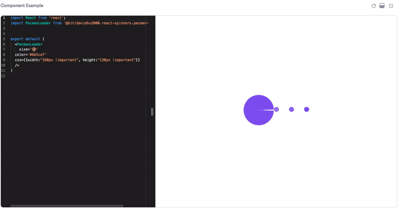
“Sandbox” example playground
In Bit.dev each component is rendered and visualized in an editable playground where you can save and edit examples. This becomes possible since Bit isolates every component and packs it with all dependencies in an independent dev environment so you can render it independently.
Unit-test results
Since Bit.dev runs CI for every component, you can view the unit-test results as docs in each component’s documentation page. This is useful since tests often reveal exactly how a component works in different edge cases.
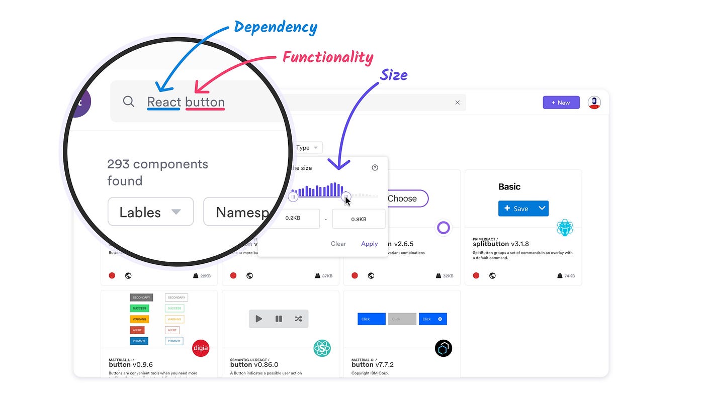
Organize and discover components
In Bit.dev components are organized and labeled based on context and functionality. You can easily search and filter components by name, framework, size, dependencies and much more. Try it out here.
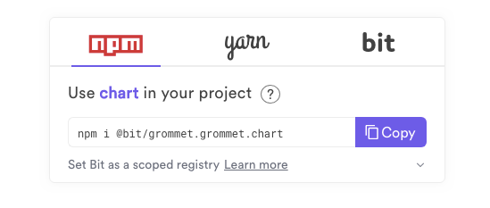
Install or fork any components
Every component can be installed right from the Bit.dev registry using npm and yarn. You can also bit import a component for local editing in any project, save a new version, and share it back to your team’s collection.
2. Setup your own static docs site
When building a library and don’t share it to a hub like Bit.dev, you will at some point have to build and maintain your own static docs site.
Luckily, the open-source ecosystem provides a verity of useful tools to help get this job done. Among the popular ones you can find GitHub Pages, Gatsby, Docz, React-static and Docusaurus (feel free to add more suggestions below and I’ll add them to the list). These tools automate and ease much of the process from zero to deploying a full wiki for your components.
3. Storybook / Styleguidist
A great addition to any static React docs site is a gallery of visual examples with tools like or Styleguidist.
StoryBook and StyleGuidist are too wonderful tools that help develop components in isolation while visually rendering and documenting them.
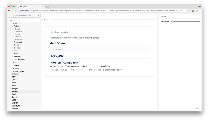
StoryBook is a development environment for UI components. It allows you to browse a component library, view the different states of each component, and interactively develop and test components. When building a library, StoryBook is a neat way to visualize and document components and different AddOns make it easier to integrate into your different tools and workflows.
Since supporting the component-story-format (CSF), stories written in that format can be rendered in many places including in your Bit.dev collection.

StyleGuidist is an Isolated React component development environment with a living style guide. It provides a hot reloaded dev server and a living style guide that lists component propTypes and shows editable usage examples based on .md files. It supports ES6, Flow and TypeScript and works with Create React App out of the box. The auto-generated usage docs can help Styleguidist function as a documentation portal for your team’s different components.
- Also check out UI Zoo by Noam Elboim.
4. Codesandbox / Stackblitz / Codepen
Component playgrounds are a neat way to play with components and learn how they work. When you can combine them as part of your documentation (or as part of your shared-components workflow), playgrounds help you quickly learn how code works and decide if you want to use the component.

Codesandbox is an online editor for quickly creating and playing-with small projects like components. After creating something interesting you can show it to others by just sharing the url. CodeSandbox features a live preview to show the result of the code while you’re typing and has extensions built to integrate into your different tools and your development workflow.
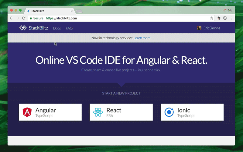
Stackblitz is an “online IDE for web applications” powered by Visual Studio Code. Much like Codesnadbox, StackBlitz is an online IDE where you can create Angular & React projects that are made shareable via a URL link. Like Codesandbox, it automatically takes care of installing dependencies, compiling, bundling, and hot reloading as you type. Take a look.
→ Find more component playgrounds for React:
- Also see: react-cosmos | react-live

