Adaptive Favicon for Modern Web Apps in React
Developing awesome dynamic favicons
Favicon is a blend of two words: favorite and icon. It can be seen in almost every web application. A unique favicon aids you in distinguishing your web application from the thousands of others.
As developers, we should always strive to utilize the modern browser’s capabilities to provide the best possible experience to our users. With that comes the ability to make the traditional favicons adaptive and exciting for modern users.
This article will discuss how to develop and use adaptive SVG favicons in your React project and their advantages.
What is a favicon?
A favicon, also known as a favorite icon, is a small image that you can add to your website to appear next to the title in web browser tabs. However, it is not the only place where a favicon appears.
Favicons will also appear in bookmarks, browser history, search engine results, and even website shortcuts on desktops and mobile devices.
Why should you add a favicon?
Let’s look at why you should include a favicon in your web project.
Increase User Attraction
Favicons are an excellent way to capture user attention and raise brand awareness. Users recognize websites with favicons more quickly than those without them. When you have a memorable favicon, it is easier for you to find your website in your browser history or bookmarks list.
When users add a shortcut to your website on their desktop, taskbar, or mobile device screen, they will be pleased to see an appealing favicon instead of a grey-colored browser icon.
SEO
As previously discussed, having a favicon on your website increases user engagement. Therefore, this improves the SEO of your website. Furthermore, modern web browsers search for a favicon image on your website, and if none are found, a 404 Not Found error is logged to the console. This situation is not good for SEO.
Simplicity
Favicon is the visual face of a specific brand and will help developers keep the design simple. Simple colors used in favicons, the small sizes, and the simplicity of the shape will help attract specific consumers of a brand. On the other hand, too much detail will make the Favicon look messy and cluttered.
Improve the legitimacy of your web app
Modern companies care about their online image since it is vital for the business’s success. So, the first appearance for a potential customer will judge the business’s quality and marketing strategies. So adequately used custom-made favicons will help gain the trust of their customers and ensure credibility to the company.
Modern browser changes for adaptive favicon support
Instead of a standard favicon.ico file, we can use an SVG favicon to create adaptive favicons. SVG favicons are supported by the latest versions of Google Chrome, Microsoft Edge, Firefox, and Opera browsers.
There are benefits of using SVGs instead of standard .ico files. First, You can easily style them with CSS. Second, you don’t have to worry about losing image quality when scaling (no need to have multiple size favicons). Third, you can create a favicon that adapts to the user’s color theme.
However, it will be best if you can keep a .ico favicon for users with older browser versions to provide a good experience.
Adding an adaptive favicon
To make an awesome adaptive favicon, include a favicon.svg file in your project. For example, you can make a “icons” folder in your React project and place the favicon.svg file inside.
Then, as shown below, set the favicon’s path in the index.html file. The inclusion of both .ico and .svg files ensure that the .ico file is loaded if SVG favicons are not supported in the user’s browser.
<link rel="icon" href="./icons/favicon.ico" sizes="any" />
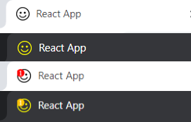
<link rel="icon" href="./icons/favicon.svg" type="image/svg+xml" />You can detect whether the user is using a light or dark color theme by using the prefers-color-scheme CSS media feature. Let’s use this to change the colors of our SVG favicon for the dark theme.
@media (prefers-color-scheme: dark) {
  .favicon-smiley { fill: #FFFF00 }
  .notification-background{ fill: #FFC300 }
}
You can include the above code within the SVG file’s <style> tags and any other CSS styles you want to add to the favicon.
Your favicon’s color will change when the user switches to a dark theme.
You can also easily add a notification badge to your favicon by adding two more SVG elements. The <circle> element can be used as the notification badge’s background. On the other hand, the <text> element can be used to display the notification count. There, You will have to set the position values of these two elements depending on the size of your SVG’s viewBox.
<circle class="notification-background" cx="140" cy="140" r="140" />
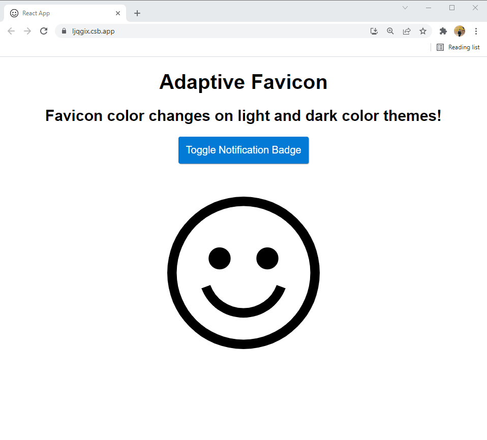
<text class="notification-number" x="130" y="230"> 1 </text>Then, using React’s states, we can toggle the favicon and display a favicon with a notification badge if the user has notifications. I have used the useState hook in my code and implemented a toggle button to switch between the favicons with and without notification.
I have also implemented the SVG used for the favicon as a React component, and you can see a demo of how this works below.
You can check out the code and play with it from here!
Conclusion
In this article, I have discussed what a favicon is, why you should have one for your website and how you can use an SVG favicon to take advantage of the capabilities of modern browsers.
I hope this article has given you some insight into how you can create adaptive SVG favicons in your React project and the advantages of using them.
Thank you for reading, and happy coding!
Bit: Feel the power of component-driven dev
Say hey to Bit. It’s the #1 tool for component-driven app development.
With Bit, you can create any part of your app as a “component” that’s composable and reusable. You and your team can share a toolbox of components to build more apps faster and consistently together.
- Create and compose “app building blocks”: UI elements, full features, pages, applications, serverless, or micro-services. With any JS stack.
- Easily share, and reuse components as a team.
- Quickly update components across projects.
- Make hard things simple: Monorepos, design systems & micro-frontends.

