Building Reusable Material UI Components for React Hook Form
Build cleaner, more maintainable forms by combining react-hook-form Controller with reusable Material UI components shared with Bit

When working with forms in React, React Hook Form (RHF) stands out for its simplicity and performance. However, integrating third-party UI libraries like Material UI (MUI) can present challenges.
React Hook Form’s register method is sufficient for native HTML elements and React components that expose their ref. However, not all third-party UI libraries, and not all components included in these libraries, do so.
In this blog, we’ll explore how RHF’s Controller component helps overcome these challenges and how reusable components shared with Bit can simplify your workflow.
Why register Isn’t Enough for Material UI Components
The register method in react-hook-form binds input fields to the form state. While effective for native inputs, many Material UI components, such as TextField and Select, don’t directly expose a ref. Without direct access to the DOM element via ref, the register method cannot function as expected.
import React from "react";
import { useForm } from "react-hook-form";
import { TextField } from "@mui/material";

interface FormValues {
  firstName: string;
}

function MyForm() {
  const { register, handleSubmit } = useForm<FormValues>();

  return (
    <form onSubmit={handleSubmit(data => console.log(data))}>
      {/* Error: MUI TextField does not expose a 'ref' for 'register' */}
      <TextField {...register("firstName")} label="First Name" />
    </form>
  );
}
Attempting to use register this way results in an error. To resolve this, you can use the Controller component or, in some cases, pass the register method’s ref to the internal input element via MUI properties like inputRef.
As mentioned, this blog will explore the former alternative, using the Controller.
Solving the Problem with Controller
The Controller component from react-hook-form acts as a bridge between the form state and UI components. It wraps the Material UI components, managing their state and ensuring synchronization with the form’s validation logic.
Using Controller with Material UI:
import React from "react";
import { useForm, Controller } from "react-hook-form";
import { TextField } from "@mui/material";

interface FormValues {
  firstName: string;
}

function MyForm() {
  const { control, handleSubmit } = useForm<FormValues>();

  return (
    <form onSubmit={handleSubmit(data => doSomething(data))}>
      <Controller
        name="firstName"
        control={control}
        defaultValue=""
        render={({ field }) => (
          <TextField {...field} label="First Name" variant="outlined" />
        )}
      />
    </form>
  );
}
Creating Reusable Controlled Components
While Controller simplifies the integration of MUI with react-hook-form, wrapping every component in Controller across your app becomes repetitive and error-prone. The solution? Create reusable controlled components that encapsulate the Controller logic.
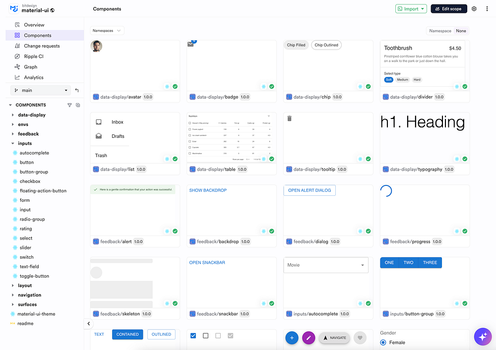
To get started as fast as possible we’ll make use of the MUI components shared (individually) on the ‘material-ui’ scope on Bit Platform.
Install Bit and create a new Bit workspace, if you haven’t already (replace my-account with your username or organization on Bit platform):
npx @teambit/bvm install
bit init rhf-mui-components --default-scope my-account.rhf-mui
cd rhf-mui-components
Lean more about Bit in the official Bit documentation.
Fork (create a clone) of the MUI component you need to wrap with the react-hook-form Controller component. For example, we’ll fork the TextField component. We’ll copy the bit fork command from the ‘Use’ menu in the text-field component page
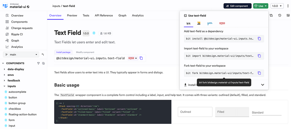
Paste and run the fork command in your Bit workspace directory:
bit fork bitdesign.material-ui/inputs/text-fieldThis will create a copy of the TextField component source files, along with a few configurations. It will also install the component’s dependencies in your workspace.
Our TextField component at this stage is a simple wrapping of the original MUI component:
import {
  TextField as BaseTextField,
  TextFieldProps as BaseTextFieldProps,
} from '@mui/material';

export type TextFieldProps = {
// ...
} & BaseTextFieldProps

export function TextField({ ...rest }: TextFieldProps) {
  return <BaseTextField {...rest} />;
}
We’ll start by installing React Hook Form in our workspace:
bit install react-hook-formFinally, we can use the Controller component from react-hook-form to wrap our TextField :
import {
  TextField as BaseTextField,
  TextFieldProps as BaseTextFieldProps,
} from '@mui/material';
import { Controller, useFormContext } from 'react-hook-form';

export type TextFieldProps = {
  /**
   * The name of the field in the form context.
   */
  name: string;
} & BaseTextFieldProps;

export function TextField({ name, ...muiProps }: TextFieldProps) {
  /**
   * get the control from the form context.
   * alternatively, you can pass the control prop directly.
   */
  const { control } = useFormContext();
  return (
    <Controller
      control={control}
      name={name}
      render={({ field }) => <BaseTextField {...field} {...muiProps} />}
    />
  );
}
The text-field component has a
.docs.mdxfile for documentation and a.composition.tsxfile for component examples. These should be updated as well to address the component’s new implementation.
To share this components as a Bit component/ node package, tag it with a release version and export:
bit tag --message "first version"
bit export
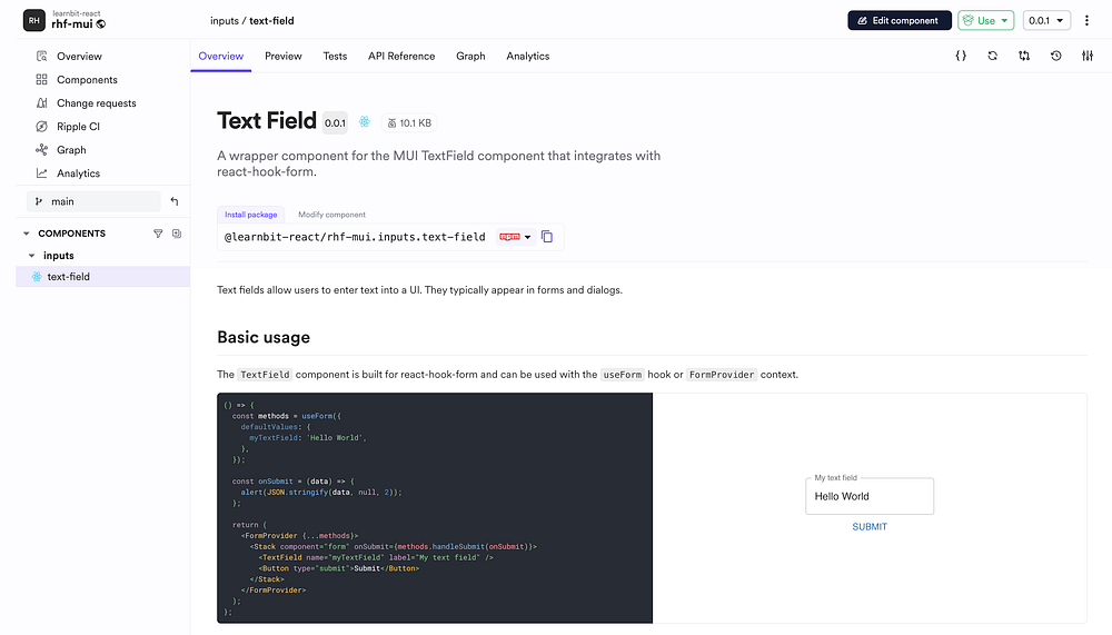
The component is built on Ripple CI and exported to your scope on Bit Platform.
For example, see this TextField component in the Learn Bit scope.
To use this component in other projects, copy the package name from the component’s page and install it using Bit or standard package managers like NPM:
npm i @learnbit-react/rhf-mui.inputs.text-fieldUse it in your project. For example:
import { useForm, FormProvider } from 'react-hook-form';
import { TextField } from '@learnbit-react/rhf-mui.inputs.text-field';

export function FormPropsTextFields() {

  const methods = useForm({
    defaultValues: {
      myTextField: ''
    },
  });

  const onSubmit = (data) => {
    // do something with `data`
  };

  return (
    <FormProvider {...methods}>
      <Box
        component="form"
        onSubmit={methods.handleSubmit(onSubmit)}
      >
          <TextField name="myTextField" />
        <Button type="submit">Submit</Button>
      </Box>
    </FormProvider>
  );
}
Conclusion
Integrating Material UI with react-hook-form can be streamlined using Controller. By wrapping MUI components in reusable controlled components, you eliminate redundancy and ensure consistency.
Taking this further with Bit allows your team to share, version, and collaborate on these components effectively. By leveraging Bit, you create a scalable system that boosts productivity and maintains a clean, DRY codebase.
