Creating a Developer Website with Bit Components
How I built my portfolio using independent React components.

As a developer, I’ve been building software that addresses real-world challenges and positively impacts people’s lives. However, I’ve never had a single location to showcase my skills and the fantastic products I’ve built.
Hence, I took it upon myself to build a portfolio application to help establish new connections with people fond of my work. So, I started pondering about my site and thought about the tech stack in general. Because for me, building something is about more than just using the day-to-day React or Angular app. It’s about discovering new tools and learning while I do fantastic projects!
I spent a few days finding the right tech stack for this project. And on a casual Sunday evening, I finally discovered Bit and the independent component pattern.
Bit is a tool that helps developers build component-based applications and collaborate on components independent of a git repo or any other development setup.
This piqued my interest because some of the biggest challenges I’ve had working in the industry is that applications become very difficult to maintain as they grow. For example, your project might have tens of thousands of lines of code maintained as a giant monolith application, drastically reducing its maintainability, scalability, and its code reusability.
Contrary to that, Bit components are independent modular codebases with a clear dependency graph that allows you to understand how each component affects other components, all the way to the app component (or multiple app components). Each component can also be used more than once to compose different apps, drastically reducing the amount of code you need to maintain.

Not so long ago, I came across Bit, and it felt like the perfect solution to this dreadful monolith.
But wait, what are Bit components?
Now you might wonder, “don’t I already use components in a React application”. You’re right. You do. However, a Bit component is treated as a wholly isolated entity, designed, developed, tested, deployed, and versioned in complete isolation from the rest.
A Bit component is more than a group of source files; it has its own dependency graph, configuration, development environment, artifacts, and more. All these enable it to be authored, maintained, collaborated on, and shared as an independent module.
One important thing to note is that although a Bit component is not a package, it does include a package as one of its artifacts. This package can be consumed in any standard project (that does not use Bit).

Building my portfolio with Bit + React
With this in mind, I developed, tested and deployed a fully functional portfolio using Bit and React!
You can visit it right now through this URL — https://portfolio-showoff-production.netlify.app.
Everything, from the actual React application to the router to the webpack configuration, is treated as a component. This lets you swap out implementations if needed, enhancing modularity.
The site has five main pages: Landing, Projects, Contact, About and a Detailed Project Page. These are shown below. Each of these pages is also a component (click on the links to see the component page).


While I was building this site, I had to understand some Bit terminology.
1. Bit Workspace
A Bit Workspace is a disposable container you can use for local development. It allows you to create new components and import/fork (clone) existing components onto the workspace. By doing so, each component is managed with its environment.
For example, you might write a backend function as a Node component that uses the Node.js environment while working on a frontend React app component, with its own React environment. You get to work on it as you normally do, but each change you make is tracked, versioned, and exported to its scope, independently.
This gives you the best of both worlds — have the experience of working in a monolith application while developing your components independently.
2. Bit Scope
Think of a scope like a collaboration server available in the cloud to host your Bit components. For example, I created a scope to host the components for my design system — https://bit.cloud/showoff/design.
The most remarkable thing about a Bit scope is that you can control the people with access to it. Fundamentally, it’s like a service for components of all types. You can control who has access to it and who can contribute to it, creating a microfrontend.

All of these scopes have components used to help build my final application. Here is a screenshot of my scopes, in my demo organization, on bit.cloud:
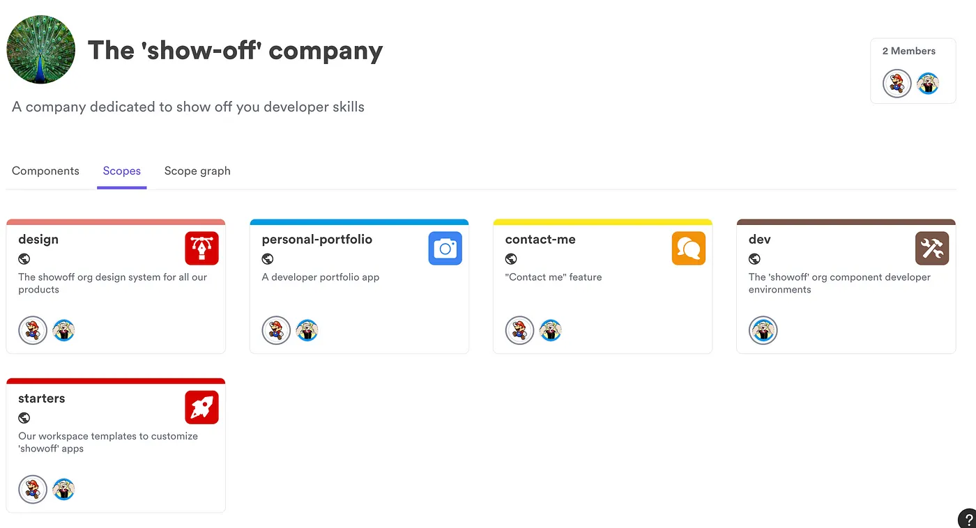
I’ve split my portfolio application into five main scopes.
- Design: The design scope holds the design system for my demo organization. It contains components such as the theming and generic elements combined to build feature components.
- Personal Portfolio: This scope contains the portfolio web application. It holds the application component that is deployed onto Netlify, as well as other portfolio components.
- Dev: The dev scope is created to maintain the development environment and configurations.
- Contact Me: The contact me scope was created to separate the contact me logic from the rest of the scopes. It’s connected with an API to support form submission.
- Starters: The starters scope holds the component responsible for building a boilerplate for others to reuse this portfolio.
All of these scopes have components that compose my ‘portfolio’ application. Here is a simple representation of how my components, hosted in each scope, are connected with each other.

By adopting the concepts of Bit along with distributed component-driven development, I developed my portfolio site using a collection of independent components. You can create templates with Bit that other people can consume. These templates clone (‘fork’) the essential components to your newly created Bit workspace.
I designed a template to help you build your portfolio in a few minutes!
Well, how can you build your own portfolio?
You can use the template I’ve created to bootstrap a Bit workspace with essential components to build your portfolio.

However, before you proceed with that, there are a few prerequisites that you will have to do. So, let’s walk through it together and build our portfolio in under 5 minutes!
1. Installing Bit
You must install the Bit CLI on your local machine before proceeding further. If you have already done this, please jump over to step 2.
If you’re new to Bit and have yet to install it, execute the command below to install the Bit CLI.
npx @teambit/bvm installTo confirm the Bit configuration, run the command bit --version and you should see the output I've shown below.

2. Creating a portfolio workspace
Next, you can start building your portfolio! All you have to do is create a workspace consisting of my portfolio template.
It contains only the most essential components to configure the portfolio for your needs. To bootstrap a portfolio workspace, execute the command shown below.
bit new portfolio portfolio-workspace --aspect showoff.starters/portfolioThis command will create a workspace using the “starter” I’ve created here. This will create a workspace with the following components:
- Light/Dark Theme
- Constants — for customizability
- Navigation bars
- Application pages
- React app
3. Inspecting the workspace
After you create the workspace, you can take a look at the components that are readily available for you by executing the command shown below.
bit startNext, open your browser and type in — https://localhost:3000 to view the component server.

Once you open your Workspace UI, you will see a namespace called apps. This is where your main React application resides.

It’s important to understand that this is a component on its own. And this is the only component with no dependents, as your app component will be used to deploy the application. This is visually represented by navigating to its dependency graph as shown below.

You can open the complete portfolio site as a React app by running the following command.
bit use apps/portfolio && bit run portfolio4. Building your portfolio
To build your portfolio, navigate to the data component in the constants namespace. This will contain the entire application configuration.


Update the constants with your personal information to start building your portfolio. Once you’re done updating the file, you’re ready with your portfolio!
5. Deploying your portfolio
Now that you’ve built your portfolio, all that is left is to show it to the world. To do so, navigate to the app component and open the portfolio.react-app.cjs file. You'll see a diagram like below.

I’ve deployed my portfolio on Netlify through Bit’s Netlify deployer component. This is highlighted in the netlify-config. You must create a free Netlify account, obtain an authentication token, and update the site names in the configuration. This will create a deployable site.
Next, run bit snap and bit tag to deploy your application! You can visit your application by appending .netlify.app to your production site name.
Concluding thoughts
Tools like Bit have drastically encouraged component-driven architecture and have started the shift in breaking down giant monolith frontend applications to simplify application development.
From the time that I’ve spent building my portfolio, I noticed that there had been an enormous increase in productivity as you naturally make highly reusable, testable and modular components that can be used across your application and even be interchanged with no negative impact.
When you integrate Bit into your development workflow, navigating and understanding your components is simple. It makes your life easier by providing a visualised dependency graph so that you can make better decisions while you refactor.
I recommend reading through their in-depth documentation to learn more about Bit or component-driven development.
This has been a fun blog post to write. I hope you can integrate a component-driven architecture into your development workflow as I did.
Thank you for reading!
