Creating Modals in Angular
Different methods and tools for building modals in Angular
Modals are one of the most common things you will see on any webpage. They are used from displaying additional info to implementing login/registration forms. They help to add extra web content to a page when the page is already heavy with HTML elements. We see modals on Twitter when we want to comment on a tweet. On Facebook when we want to comment on a post.
Modals are easy to implement even in vanilla JS/HTML apps. With the emergence of JS frameworks, the frameworks also have provided an easy way for us to still use modals in their framework because we just can’t do away with it. Most popular CSS frameworks
- Material Design
- Bootstrap
- Semantic UI
- Tailwind
have implemented Modals/Dialogs to a very high degree that we can seamlessly incorporate them into our app.
So in this post, we will see how to create Modals in Angular. First, we install tools that we will need.
Tip: Use Bit to collaborate on Angular components for faster development and more consistent UI/UX
Use Bit to share, install and collaborate on individual Angular components. Stop wasting time configuring packages, managing multiple repositories or maintaining cumbersome monorepos.
Check out this Angular (reusable) modal component:
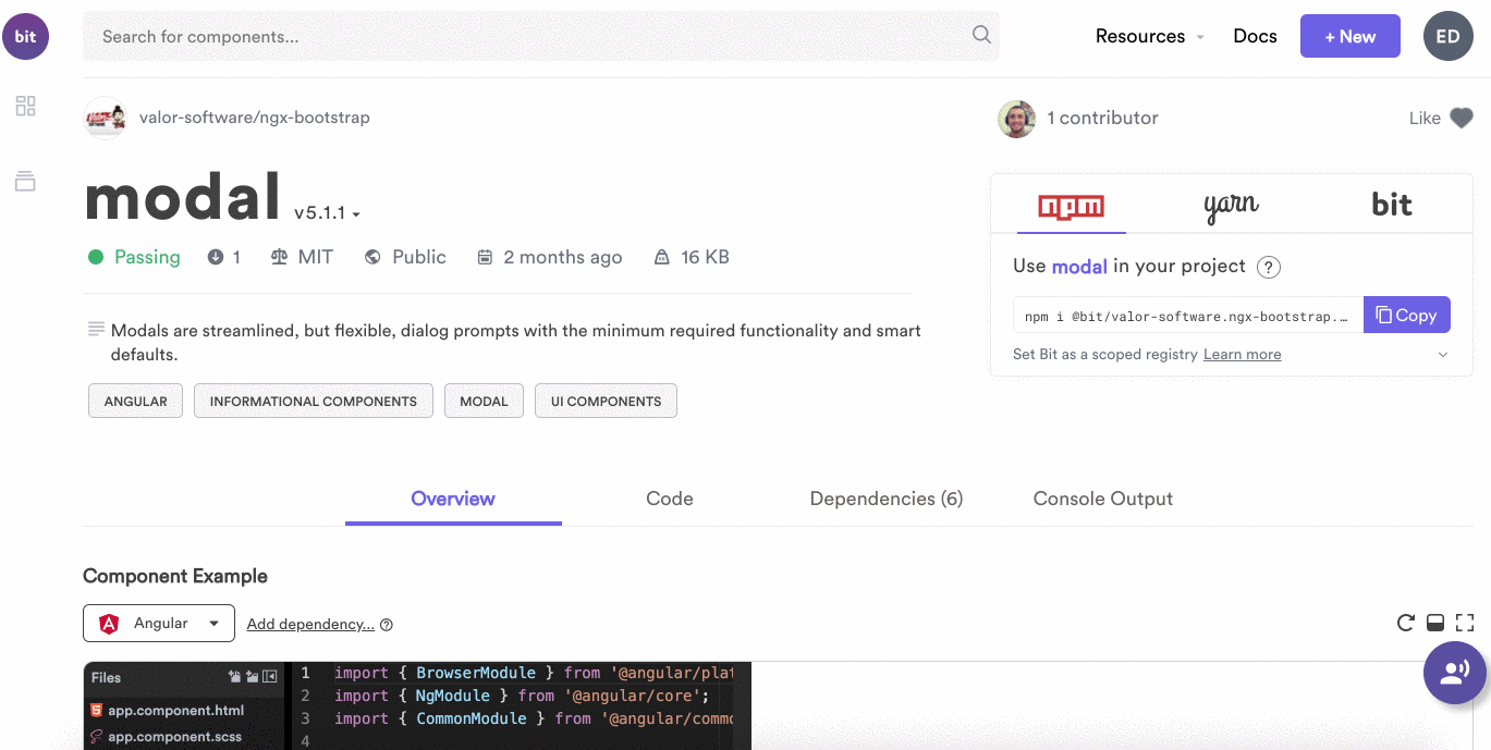
For a glimpse into Bit and some other Angular dev tools, check out this article:
Environment Setup
Development in Angular uses the Node environment to work. So we will download and install dependencies and software we need:
Nodejs This is the main software we will need. If you don’t have it installed on your machine, go to Nodejs Page and download the binary meant for your machine OS
NPM This is the most widely used Node Package manager in the world right. You don’t have to install it separate it comes with the Nodejs binary.
ng CLI This is an NPM CLI tool for scaffolding of Angular projects. To install it, run the below command:
npm i @angular/cli -gModals in Angular
We will create a component that will contain the markup that we want to be rendered as a modal.
    <modal>
        <h1>Modal title</h1>
        <div class="body">
            Modal body
        </div>
    </modal>
The content or markup we want to be in modal will be placed between the element. The modal component will look like this:
@Component({
    selector: 'modal',
    template: `
        <div class="mmodal">
            <div class="mmodal-body">
                <ng-content></ng-content>
            </div>
        </div>
        <div class="mmodal-background"></div>
    `,
  styleUrls: ['./modal.component.css']
})
export class ModalComponent implements OnInit {    constructor(private el: ElementRef) { }    ngOnInit() {
        // we added this so that when the backdrop is clicked the modal is closed.
        this.el.nativeElement.addEventListener('click', ()=> {
            this.close()
        })
    }    close() {
        this.el.nativeElement.classList.remove('sshow')
        this.el.nativeElement.classList.add('hhidden')
    }
}
This is our modal component. We injected the ElementRef class so we can have access to the component’s DOM in the browser. With reference to its DOM we can manipulate its visibility. See that we are using ng-content to project the children elements between the div.class="mmodal-body" element.
We have a few CSS classes: mmodal, mmodal-body and mmodal-background, hhidden, sshow.
The CSS mmodal holds style that defines the basic structure of our modal. sshow makes the modal component visible. hhidden makes the modal component invisible. mmodal-background covers the background elements whenever the modal shows so as to prevent the user from interacting with them when the modal is open.
Let’s look at the CSS:
// this makes the .modal visible
.sshow {
    display: block;
}// this makes the element hidden/invisible
.hhidden {
    display: none;
}// this holds the CSS display of the modal
.mmodal {
    // makes it hover above all elements
    z-index: 1000;
    position: fixed;
    top: 30px;
    bottom: 0;
    left: 300px;
    width: 500px;
}.mmodal-body {
    background: #fff;
    margin: 40px;
    padding: 20px;
}// backdrop color
.mmodal-background {
    // should be below the .modal but above all other elements
    z-index: 900;
    position: fixed;
    top: 0;
    right: 0;
    bottom: 0;
    left: 0;
    background-color: #000;
    // makes the below elements visible to a degree.
    opacity: 0.95;
}
Now, let’s create a component we will place a nodal on:
ng g showmodal@Component({
  selector: 'app-showmodal',
  template: `
    <button (click)="showDialog()">Open Dialog</button>    <modal id="modal_1" class="hhidden">
        Dialog Header
        <button>Close Dialog</button>
    </modal>
  `,
  style: []
})
export class ShowModalComponent {
    showDialog(){
        let modal_t  = document.getElementById('modal_1')
        modal_t.classList.remove('hhidden')
        modal_t.classList.add('sshow');
    }
    closeDialog() {
        let modal_t  = document.getElementById('modal_1')
        modal_t.classList.remove('sshow')
        modal_t.classList.add('hhidden');
    }
}
Here we have the modal component with some elements inside it. The modal component will be invisible when the ShowModal component renders, on clicking the Open Dialog button the modal component is displayed, showing high above other components. If we click on the Close Dialog button the modal component is removed from the screen. Looking into the click functions run when the buttons are clicked. They simply get a reference to the modal component HTMLElement instance and use the classList methods add and remove to toggle its display on and off.
Using <ng-template>
We can use the ng-template to display modals in Angular. Let’s see how.
We will re-write our above implementation to use ng-template
@Component({
  selector: 'app-showmodal',
  template: `
    <ng-container #vc></ng-container>
    <button (click)="openDialog()">Open Dialog</button>
    <button (click)="closeDialog()">Close Dialog</button>    <ng-template #modal_1>
        <modal id="modal_1" class="hhidden">
            Dialog Header
            <button (click)="closeDialog()">Close Dialog</button>
        </modal>
    </ng-template>
  `,
  styleURL: ['showmodal.component.css']
})
export class ShowModalComponent {
    @ViewChild('modal_1') modal_1: TemplateRef<any>;
    @ViewChild('vc') vc: ViewContainerRef;    showDialog(){
        let view = this.modal_1.createEmbeddedView(null);
        this.vc.insert(view);
        this.modal_1.elementRef.nativeElement.previousElementSibling.classList.remove('hhidden');
        this.modal_1.elementRef.nativeElement.previousElementSibling.classList.add('sshow');
    }

    closeDialog() {
        this.vc.clear()
    }
}
We enclosed the modal component in ng-template tag. ng-template tag is Angular's equivalent of HTML's template. ng-template is used to hold elements that are to be created and added to the DOM. As they are, the elements are not created, the browser removes them entirely from the DOM and adds a comment in their place, so you see it is not hidden but removed from the DOM.
To create templates in Angular we use the ng-template tag and referred to it using the # followed by the name you give it. In our case, we used #modal_1 to reference from our code.
We created an ng-container, this is where we will insert the ng-template. See also that the ng-container has a reference variable #vc with this we can reference the ng-container from the component.
In our component, we will reference modal_1 to give the instance of ng-template#modal_1, we did it using the @ViewChild decorator @ViewChild('modal_1') modal_1: TemplateRef<any>;. Then we will reference ng-container#vc, we did it using @ViewChild : @ViewChild('vc') vc: ViewContainerRef;.
We have two buttons: Close Dialog and Open Dialog. Open Dialog when clicked creates a view from the elements inside ng-template#modal_1, it is similiar to creating DOM nodes in JS. modal_1 variable holds the reference, then we use the insert method of ViewContainerRef to insert the created ng-template#modal_1 DOM nodes to the ng-container#vc node this.vc.insert(view);
The Close Dialog button is used to clear the ng-template#modal_1 DOM node inserted earlier from the ng-container#vc node.
In summary, when the Show Dialog button clicked all that happens above, causes the modal dialog to show up and the Close Dialog, when clicked, causes the opened modal to close.
Using Bootstrap
Here we will use bootstrap.
First, we install the bootstrap library:
npm i bootstrapWe tell the CLI project to use the styles in the Bootstrap CSS file. Edit .angular.json and add the following entry under styles:
"../node_modules/bootstrap/dist/css/bootstrap.css".@Component({
selector:'showmodal',
template: `
<h2>Creating Modals with Twitter Bootstrap</h2> <!-- Button trigger modal -->
<button class="btn btn-primary btn-lg" (click)="showDialog()"> Launch Modal </button>
<ng-container #vc></ng-container> <ng-template #modal_1>
<!-- Modal -->
<div class="modal fade" id="myModal" tabindex="-1" role="dialog" aria-labelledby="myModalLabel" aria-hidden="true">
<div class="modal-dialog">
<div class="modal-content">
<div class="modal-header"> <button type="button" class="close" data-dismiss="modal" aria-hidden="true"> × </button>
<h4 class="modal-title" id="myModalLabel"> This Modal title
</h4>
</div>
<div class="modal-body"> Add some text here </div>
<div class="modal-footer">
<button type="button" class="btn btn-default" data-dismiss="modal" (click)="closeDialog()">Close </button>
</div>
</div>
<!-- /.modal-content -->
</div>
<!-- /.modal -->
</div>
</ng-template>
`
})
export class ShowModalComponent {
@ViewChild('modal_1') modal_1: TemplateRef<any>;
@ViewChild('vc', {read: ViewContainerRef}) vc: ViewContainerRef;
backdrop: any showDialog(){
let view = this.modal_1.createEmbeddedView(null);
this.vc.insert(view); this.modal_1.elementRef.nativeElement.previousElementSibling.classList.remove('fade');
this.modal_1.elementRef.nativeElement.previousElementSibling.classList.add('modal-open');
this.modal_1.elementRef.nativeElement.previousElementSibling.style.display = 'block';
this.backdrop = document.createElement('DIV')
this.backdrop.className = 'modal-backdrop';
document.body.appendChild(this.backdrop)
}
closeDialog() {
this.vc.clear()
document.body.removeChild(this.backdrop)
}
}
Here, enclosed a Bootstrap modal in ng-template. We have an ng-container tag where the Bootstrap modal inside the ng-template will be rendered. We got the reference of both the ng-template and ng-container using ViewChild decorator. This is the same as we did previously difference is that we referenced the DOM node inside the ng-template because will use the reference to toggle the class names and display style to show and close the modal.
We got the DOM node using the elementRef property in the TemplateRef class, the property returns a nativeElement which points to the HTMLElement. With the HTMLElement the ng-template previous element sibling which will be the element inside its tags. With this reference, we set out to manipulate the class names and styles so as to show or close the modal.
I got the information on how to show Bootstrap modals from its sources. To show a modal, you remove the class name fade
this.modal_1.elementRef.nativeElement.previousElementSibling.classList.remove('fade');and add the class name modal-open
this.modal_1.elementRef.nativeElement.previousElementSibling.classList.add('modal-open');Then, the style display is set to block
this.modal_1.elementRef.nativeElement.previousElementSibling.style.display = 'block';This will cause the modal to become visible.
The Close button on the modal when clicked will clear the modal. The closeDialog it calls just calls the clear() method in the ViewContainerRef instance, this method destroys all views in the container.

Conclusion
You see how easy it is to create modals in Angular. There are so many techniques to create your modals in Angular, some might not follow the method in this article.
What did we use? We used ViewChild decorator, ViewContainer, TemplateRef, Template Reference, Components. Doing this on your own will go a long way to help you understand this seemingly hard and complex Angular concepts.
If you have any question regarding this or anything I should add, correct or remove, feel free to comment, email or DM me.
Thanks!
Build Angular Apps with reusable components, just like Lego

Bit’s open-source tool help 250,000+ devs to build apps with components.
Turn any UI, feature, or page into a reusable component — and share it across your applications. It’s easier to collaborate and build faster.
Split apps into components to make app development easier, and enjoy the best experience for the workflows you want:

