Difference Between Design Tokens and Design Variables in CSS
Design Tokens vs Design Variables
Design tokens and design variables are two techniques used in modern web designing to improve the consistency and maintainability of design systems. Although these terms are frequently used interchangeably, they have some significant differences.
For example, design tokens are a set of values defining a user interface’s visual design. In contrast, design variables are dynamic values that control the behavior of a design system. This article will explore the differences between design tokens and design variables using examples to help you understand these concepts.
What are design tokens?
Design tokens are a collection of attributes that can be applied to various projects, platforms, and teams. These attributes include colors, typography, spacing, and other design elements used to develop a consistent design. The main objective of design tokens is to promote consistency and reduce the need for manual design changes.
Design tokens are typically defined in a JSON or YAML file, which can be shared and used with various design tools and platforms. Tokens for design can be used in multiple ways, such as variables in CSS, design systems, and data for design tools.
What are design variables?
Design variables serve a similar purpose as design tokens in maintaining consistency across a design system. However, they are primarily utilized in CSS, whereas design tokens can be applied across various platforms and teams.
Design variables refer to CSS variables that store specific design elements, such as colors, typography, and spacing, which can be utilized throughout an application. Instead of individually modifying each CSS element, designers can quickly make changes by using design variables. This simplified design process helps to maintain design consistency throughout the application.
Design Tokens vs Design Variables
The below table will provide a clear picture of some significant differences between design tokens and design variables.

How to use design tokens
For example, assume you have defined a design token named primaryColor in a separate file.
{ "primaryColor": "#0070f3" }Now, you need to reference this token in your CSS stylesheet like below. It will apply the primaryColor as the background-color of all the buttons.
button { background-color: var(--primaryColor); }Since now you know the basics, let’s apply it in a React application.
Step 1 — Create a design token file
Start by creating a file (tokens.js) to define your design tokens. Here, the tokens file defines a color object with primary and secondary properties.
const tokens = {
  colors: {
    primary: '#0070f3',
    secondary: '#ffcd00',
  },
};

export default tokens;
Step 2 — Create a theme provider component
Creating a theme provider component will allow you to update the design tokens in a single location easily. We can wrap the entire application with the theme provider component and use a context object to pass the design token to the child components.
So, create a new component named ThemeProvider.js, import the design tokens from tokens.js file and use the createContext method from React to create a new context.
import React, { createContext } from 'react';
import tokens from './tokens';

export const ThemeContext = createContext();

export const ThemeProvider = ({ children }) => {
  return (
    <ThemeContext.Provider value={{ theme: tokens }}>
      {children}
    </ThemeContext.Provider>
  );
};
Step 3: Wrap the application with the theme provider
Wrap your App component with the ThemeProvider so that the ThemeContext is accessible to all child components.
import React from 'react';
import { ThemeProvider } from './ThemeProvider';
import Button from './Button';

function App() {
  return (
    <ThemeProvider>
      <div>
        <Button color="primary">Primary</Button>
        <Button color="secondary">Secondary</Button>
      </div>
    </ThemeProvider>
  );
}

export default App;
Step 4: Import ThemeContext
In the Button.js file, import the ThemeContext from the ThemeProvider.js file using the useContext Hook. Then, use ThemeContext to access the colors object defined in your tokens.js file.
import React, { useContext } from 'react';
import { ThemeContext } from './ThemeProvider';

const Button = ({ children, color }) => {
  const { theme } = useContext(ThemeContext);
  const { colors } = theme;

  const buttonColor = colors[color] || colors.primary;

  return (
    <button
      style={{
        backgroundColor: buttonColor,
      }}
      {children}
    </button>
  );
};

export default Button;
In the above code, the color prop is passed to the Button component to dynamically set the backgroundColor. If the color prop doesn't match the defined colors in the tokens.js file, the primary color will be used by default.
Finally, add some inline styles to the button element to style it a bit more.
import React, { useContext } from 'react';
import { ThemeContext } from './ThemeProvider';

const Button = ({ children, color }) => {
  const { theme } = useContext(ThemeContext);
  const { colors } = theme;

  const buttonColor = colors[color] || colors.primary;

  return (
    <button
      style={{
        backgroundColor: buttonColor,
        borderradius: '25px',
        padding: '10px',
        margin: '10px',
        borderRadius: '5px',
        border: 'none',
        color: 'white',
        display: 'inline-block',
      }}
    >
      {children}
    </button>
  );
};

export default Button;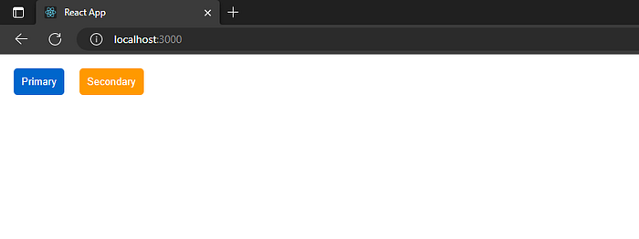
This example demonstrates how to implement design tokens in a React application. It’s a simple but powerful approach to ensure consistency and maintainability.
You can find the complete code of this example in my GitHub repo and a working demo in StackBlitz.
How design tokens are helpful when using design systems
A design system is a set of reusable components, patterns, and guidelines that promote consistency in the design process. To achieve this, developers and designers must ensure that all elements, such as color, typography, and spacing, remain consistent across all components and applications.
That’s where design tokens come in. They provide a centralized place to manage design properties and a standardized way to share them. This helps developers and designers to maintain consistency in the design system, ensuring that the designs remain up to date while avoiding duplication of effort.
💡 Pro Tip: You can use design tokens to build your own design system with open-source tools such as Bit, creating themes that maintain consistency in design across multiple applications thereby improving the developer experience and enhancing team collaboration across the board.
Find out more from these tutorials:
Advantages of using design tokens for design systems
Here are some of the most common advantages of using design tokens for design systems.
Here are some of the most common advantages of using design tokens for design systems.
- Consistency: Maintaining a unified and consistent look and feel is simpler when you define a standardized set of values for your design properties.
- Scalability — Design tokens provide a central point of truth for your design attributes that can be easily shared across teams and projects. So it is easier to scale your design system with as many components as necessary.
- Adaptability — You can use distinct sets of tokens for desktop and mobile applications, various languages, or geographical areas.
- Efficiency — By defining a standardized set of values for your design properties, you can reduce the time spent on design choices and iterations.
- Collaboration — Since design tokens are defined in a separate file, designers and developers can work independently on their respective tasks without stepping on each other’s toes.
How to use design variables
For example, let’s say you have a website with a primary color of blue. If you want to change the primary color to green, you would need to go through every component and style that uses blue and change it to green. This can be time-consuming and error-prone.
With design variables, you can define the primary color as a variable ($primary-color: blue), and use it throughout your application wherever you need the primary color. If you want to change the primary color to green, you can simply update the variable, and the change will be reflected throughout the application.
Here are some examples of design variables:
$primary-color: blue;- defines the primary color used throughout the application.$secondary-color: green;- defines the secondary color used throughout the application.$font-family: 'Open Sans', sans-serif;- defines the font family used throughout the application.$font-size-base: 16px; - defines the base font size used throughout the application.$border-radius: 5px;- defines the default border-radius used throughout the application.$spacing-unit: 8px;- defines the default spacing unit used throughout the application.
Now, let’s see how we can use design variables in a React application.
Step 1 — Create a style file for the index
Create a new file called index.css in the src folder, and define the design variables for using CSS custom properties.
:root {
  --button-color: #007bff;
  --button-border-radius: 4px;
}

button {
  background-color: var(--button-color);
  color: white;
  border-radius: var(--button-border-radius);
  border: none;
  padding: 8px 16px;
  font-size: 16px;
}
Here, we have defined two design variables using CSS custom properties (--button-color and --button-border-radius). We have also defined the styles for our buttons using these variables.
Step 2 — Import CSS styles
Import the necessary libraries and our CSS styles to the index.js file.
import React from 'react';
import ReactDOM from 'react-dom';
import './index.css';

function App() {
  return (
    <div><button>Button 1</button></div>
  );
}

ReactDOM.render(<App />, document.getElementById('root'));
Modify the CSS custom properties in your CSS file to change the button’s color. For example, you can change the color of the buttons by modifying the --button-color variable:
Modify the CSS custom properties in your CSS file to change the button’s color. For example, you can change the color of the buttons by modifying the --button-color variable:
:root {
  --button-color: #dc3545;
  --button-border-radius: 4px;
}
Save your changes and run the application again. You should see the color of the buttons change to red.
Conclusion
At a glance, design tokens and design variables in CSS may seem similar. But they serve different purposes and are used in different contexts. Design tokens are a set of values that represent design decisions. They provide centralized control for designers and developers to change the design system. On the other hand, design variables are used to define reusable CSS values that can be updated throughout an application.
This article discussed the difference between those concepts, code examples, and how design tokens help to build solid design systems. I hope you now understand design tokens and design variables better. Thank you for reading.
Build React Apps with reusable components, just like Lego

Bit’s open-source tool help 250,000+ devs to build apps with components.
Turn any UI, feature, or page into a reusable component — and share it across your applications. It’s easier to collaborate and build faster.
Split apps into components to make app development easier, and enjoy the best experience for the workflows you want:
