Getting Started with a New Vue.js Project in 2023
Building Better Vue.js Applications in 2023

A short backstory — Vue.js
Vue.js is a framework built on top of HTML, CSS, and JavaScript that seamlessly offers a component-driven architecture to build mission-critical production apps. When it was first announced in 2014, it took the software industry by storm, offering a better (and more progressive) approach to building frontend applications.
Unlike its competitors (React and Angular), Vue.js was specifically designed to bridge the gaps between React and Angular. It aimed to improve frontend components’ maintainability and testability by offering a more progressive approach to developing frontend apps.
It let users maintain JavaScript, HTML, and CSS code, all in a single file, which significantly helped improve component maintainability and testability.
Yet, it still wasn’t enough.
One crucial piece remained the same. Vue.js developers still had to develop and maintain their production apps as a single giant monolith. Though this works for small projects, it does not scale well for large apps.
Customers in 2023 want you to build complex apps faster.
However, developing giant Vue.js monolithic apps will not help you make such complex apps quickly. Therefore, you need to look at a better approach if you build production apps with Vue.js in 2023.
Well, how can we do better?
Recently, I came across a modernized approach towards frontend development through distributed component-driven architectures. It focuses on building frontend apps in a distributed manner, where each component could be independently designed, developed, tested, and versioned. We can significantly improve how we develop production-ready Vue.js applications by adopting this new approach.
So, what exactly is a distributed component-driven architecture?
A component-driven architecture aims to increase component reusability by decomposing large complex applications into simpler components. However, you might find this confusing as you’ve likely built many Vue.js apps through components.
However, in 2023, building components don’t cut it. You’re still trapped inside a giant monolith application, and you lose the ability to scale the app as you grow.
This is where tools like Bit come into play. Bit is a tool that helps developers build distributed component-driven applications and collaborate on components independent of a Git repo or any other development setup. It allows you to freely adopt architectural patterns such as the Micro Frontends pattern to improve your development productivity, reduce costs, and align it with your backend microservice.
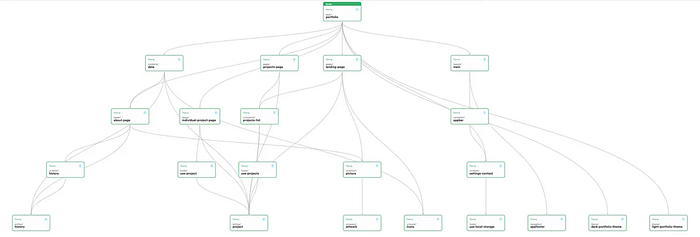
As shown above, each component is located in a separate space (isolated from the rest). Adopting such an approach allows you to design, develop, test, and version a single component in total isolation.
You no longer need access to your entire production application to change a single component! All you will need is access to your single component, which, once changed and versioned, will cycle back through its dependency tree and update all its dependents.
And, just like that, this helps save a massive amount of time as you no longer need to wait for an app to compile after making a mere change to a component’s background colour!
Let’s build a distributed component-driven app with Vue.js
Step 01 — Pre-requisites
First, you must set up Bit in your local development environment before developing a modular Vue.js app.
If you’ve configured Bit, ensure you are on the latest version.
You can install Bit by executing the command shown below:
npx @teambit/bvm installTo confirm the installation, run the command bit --version. You should see the output I've illustrated below.

Next, create an account on Bit and create a scope to export the components you will build along with me in this article!
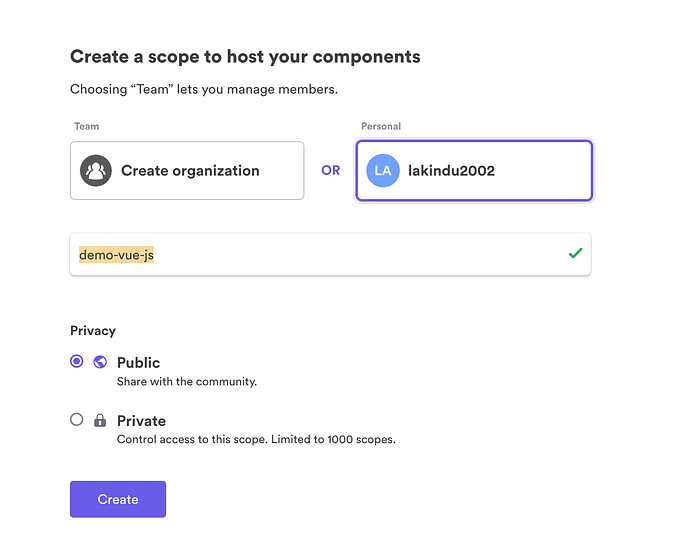
Step 02 — Initializing the development environment
Next, you will need some development space to compose your components. In Bit, this is known as a “Workspace”. Therefore, you must create a workspace that can be used to develop your Vue.js components. This can be done with the command shown below.
bit new vue my-workspace --env teambit.vue/vue --default-scope my-org.my-scopeWhen you run this command, ensure that you provide your organization and scope name and replace the default “my-org.my-scope”. For my case, I provided my Bit username and the scope I created in step 01 — “
lakindu2002.demo-vue-js".
The command above creates a new Bit workspace that will be configured to design and develop Vue.js components. It uses the teambut.vue/vue environment to provide a runtime for the Vue.js components to run.
Next, run bit start and visit http://localhost:3000 to launch your local development environment to start building your Vue.js components. You will see the snippet below.

Step 03 — Creating a Vue.js component
Now that your development server is running, you can start building your Vue.js components! With Bit, creating a Vue.js component can be done in one simple command:
bit create vue <<NAMESPACE>>/<<COMPONENT-NAME>>If you’re not familiar with a namespace is — think of it as a subdirectory to store your components in
So, if you were creating a design component such as a button, you’d write the command — bit create vue design/button. This lets you organize your components neatly within a scope. After you run the command, you'll see the directory shown below.
The biggest difference is that the Bit component is not tied to any Vue.js application. Instead, its Vue.js environment can be used to independently develop, test, and version the component.
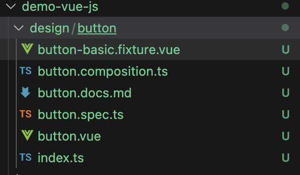
At a single glance, it’s evident that this brings about several advantages for a developer:
- By default, Bit enforces you to adopt TDD by providing a test file spec.ts, ensuring that the code you ship out is bug-free.
- Next, you’re provided with a documentation file
.mdto help keep your component documented to ensure maximum maintainability. - Additionally, you get to define compositions for your component to showcase the different variants you intend to support!
- You can adopt a good coding standard because you must think about components independently. You don’t write components thinking about its consumers. This helps you create more meaningful property names relevant to your developing component.
Step 04 — Developing a Vue.js component
Now that we’ve created a simple component (Button), let’s start building the component. Let’s start by defining the test cases for the component! Open up your button.spec.ts file and include the code below.
import { render } from "@testing-library/vue";
import { BasicButton, BlueButton, ButtonWithCustomGoodByeWorldLabel } from "./button.composition";

it("should render with the correct text", () => {
  const { getByText } = render(BasicButton);
  const rendered = getByText("Hello World");
  expect(rendered).toBeTruthy();
});

it("should render button with label Hello World with the blue color", () => {
  const { getByText } = render(BlueButton);
  const rendered = getByText("Hello World");
  expect(rendered.style.background).toBe('blue');
});


it("should render button with label Goodbye World", () => {
  const { getByText } = render(ButtonWithCustomGoodByeWorldLabel);
  const rendered = getByText("Goodbye World");
  expect(rendered).toBeTruthy();
});
We’ve included three test cases for your application.
- The first test case ensures that the Button renders with the label —
Hello World. - The second test case ensures that the Button renders with the label —
Hello World, and with the background color -blue. - The final test case ensures the button renders with a custom label —
Goodbye World.
These test cases mean that the Button component must have a default label — Hello World, and we must allow users to change this label while providing support to change the background color.
Well, let’s start designing the
Buttoncomponent now.
Open up the button.vue file and include the code shown below:
<script setup lang="ts">
import { defineProps, computed } from "vue";

const props = defineProps({
  label: {
    type: String,
    default: "Hello World",
    required: false,
  },
  style: {
    type: Object,
    default: () => ({}),
    required: false,
  },
});

const buttonStyle = computed(() => {
  return props.style;
});
</script>

<template>
  <button :style="buttonStyle">{{ label }}</button>
</template>
The code shown above defined a simple Button Vue.js component. It accepts two props - label and style to help customize the Button to help support the requirements of changing the label and color.
Next, save your code and observe the development server to see your component being rendered in real time!
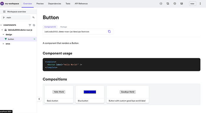
Hereafter, you can define your compositions to provide the support for your test cases to function and showcase your component’s capability! Therefore, create two new files inside the button directory:
button-blue.fixture.vuebutton-goodbye-world.fixture.vue
Hereafter, include the snippets shown below to define the composition.
// button-blue.fixture.vue

<script setup>
import Button from "./button.vue";
</script>

<template>
  <Button label="Hello World" :style="{
    background: 'blue'
  }" />
</template>

// button-goodbye-world.fixture.vue

<script setup>
import Button from "./button.vue";
</script>

<template>
  <Button label="Goodbye World" />
</template>
The two snippets defined above showcases the two compositions. Hereafter, open the button.composition.ts file and include the code shown below.
import BasicButton from "./button-basic.fixture.vue";
import BlueButton from "./button-blue.fixture.vue";
import ButtonWithCustomGoodByeWorldLabel from "./button-goodbye-world.fixture.vue"

export { BasicButton, BlueButton, ButtonWithCustomGoodByeWorldLabel };
The snippet shown above lets the spec.ts file import the components defined to help run the test cases.
Step 05 — Building a Vue.js application
Now you may wonder — “I’ve built the component, but how do I consume it?” Well, this is where the App component comes into play. Bit lets you create an App component that provides a deployable runtime for your components and enables you to build fully functional production apps using Vue.js!
To create your application, execute the command shown below.
bit create vue-app apps/hello-appThe command above creates a Vue.js application titled hello-app . This will create the folder structure shown below.
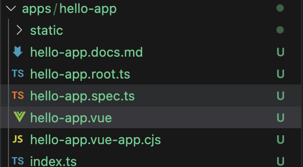
Open up the hello-app.vue and include the code below to help you use your custom Button component.
<script setup lang="ts">
import Button from "@lakindu2002/demo-vue-js.design.button";

</script>

<template>
  <Button label="Hello World" />
</template>
As shown above, this is the Button component that we created earlier! Next, you will need to let the workspace load the App as a separate instance. To do so, run the command shown below.
bit use apps/hello-appFinally, run the following command to launch your new Vue.js app!
bit run hello-app-appYes, you will need to use “app-app” if you created the app by appending “app” to the name. If you only provided “bit create app hello”, use “bit run “hello-app”.
Once doing so, you can browse the application locally.

Step 06 — Versioning and sharing the code
After you’ve built your app, you can now ship it to remote storage — scope for future maintenance.
To do so, you must “tag” your components to version them and export them to the Bit Cloud.
You can version your component by running bit tag followed by a message. For example, your command could be bit tag -m "adding a property for the button name". What's unique about this command is that it builds the component and executes its test cases to ensure you release only fully functional code.
Finally, after you’ve tagged a new version of your component, you can ship it off to the component repository — Bit Cloud using the command bit export.
Well, wasn’t this a promising approach for developing Vue.js apps?
Building frontends have come a long way since Vue.js was first launched. Gone are the times when developers tried to manage single giant monolith frontend apps. Out came the dawn of micro frontends and Bit — A modernized approach to building modular and distributed components that can be developed, tested, and versioned in isolation!
To explore what we built in this blog post, visit my GitHub Repository on Bit Cloud and have a peek!
I hope that this article helps you build amazing Vue.js apps in 2023!
Thank you for reading.
Versioning independent components the easy way using Bit
Bit’s open-source tool help 250,000+ devs to build apps with components.
Turn any UI, feature, or page into a reusable component — and share it across your applications. It’s easier to collaborate and build faster.
Split apps into components to make app development easier, and enjoy the best experience for the workflows you want:

