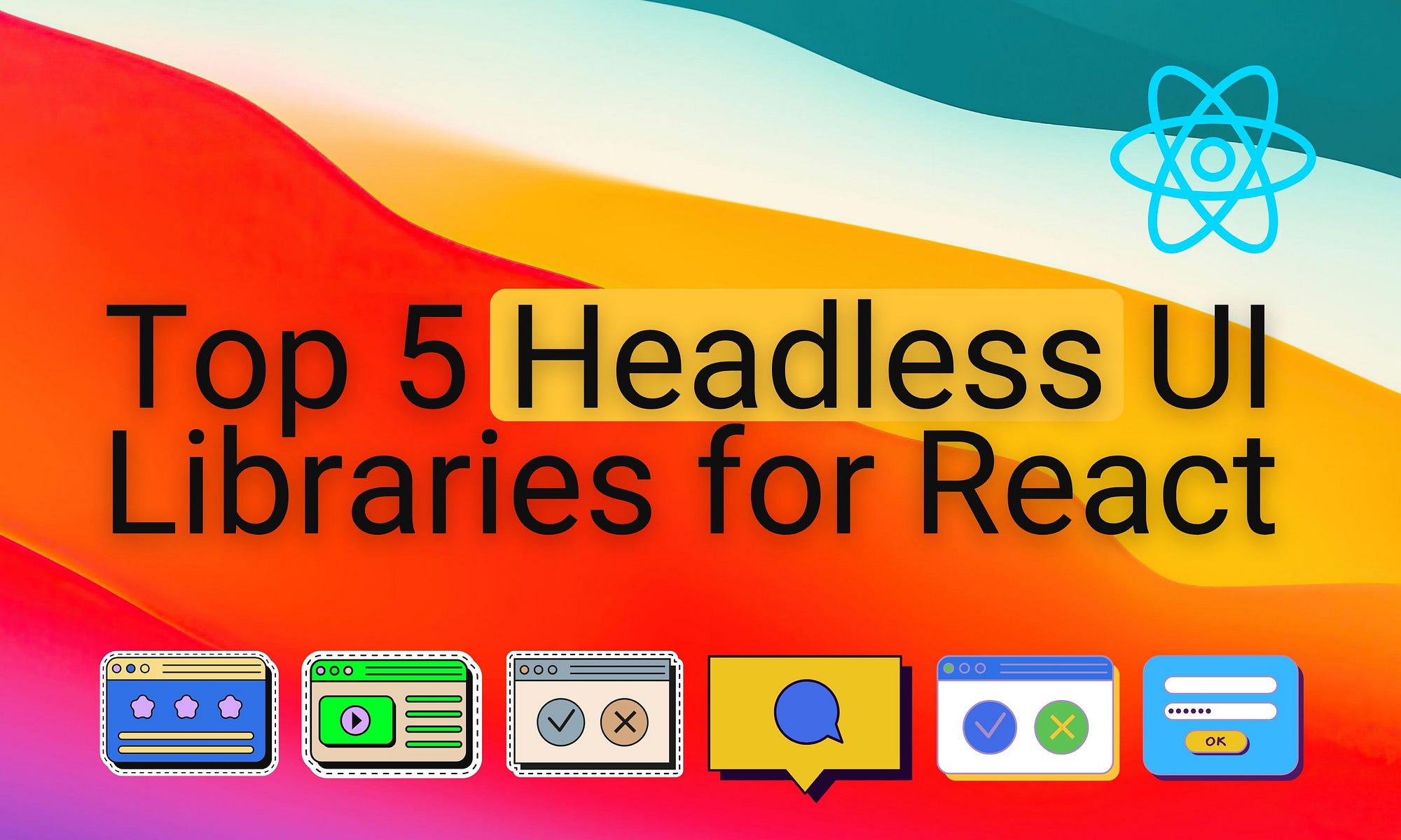
Headless UI Libraries for React: Top 5
These are the top 5 headless UI libraries you can try out for your next design system.
When building a modern design system, we look for UI libraries that are rich with components and support a higher degree of customization. The modifications to the original library vary from functional to style changes. A new trend in UI libraries is to keep minimal default styling since it always needs the look and feel customization according to the design system's color palette and branding guidelines.
These headless UI libraries empower developers and designers to craft unique interfaces that meet precise design specifications without constraints. Here’s a look at the top 5 headless UI libraries you can try for your next design system.
Introduction: Why Choose Headless UI Libraries?
Headless UI libraries provide the essential functionality of UI components without imposing a specific design or styling.
It's like offering a blank canvas, letting designers and developers shape the look and feel of the components to perfectly align with the overall aesthetic and functionality of the application.
This flexibility makes headless UI libraries ideal for building cohesive, brand-specific interfaces while maintaining consistency and accessibility across the design system.
Furthermore, using the Bit platform, you can make the design system reusable across multiple projects by making each component composable.

You can also explore design scopes based on popular component libraries in the Bit platform, which can serve as a foundation for your design system.
Look at five popular, feature-rich headless UI libraries ideal for building modern, customizable design systems.
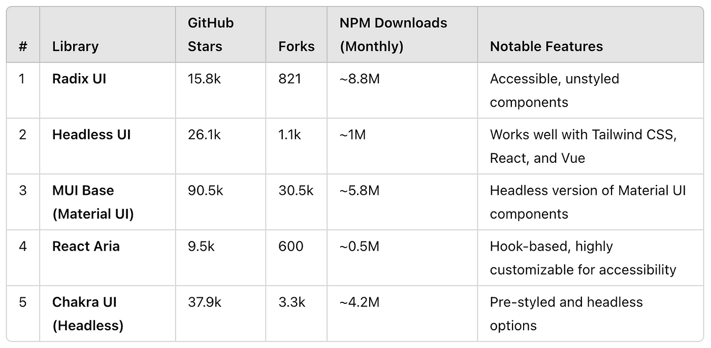
1. Radix UI
GitHub Stars: 15.8k | Forks: 821 | NPM Downloads: 8.8 M/month

Radix UI offers a suite of low-level, unstyled components for React applications, emphasizing accessibility and customization.
Each component is a flexible building block, enabling developers to construct complex, accessible interfaces without predefined styling constraints.
Radix UI provides developers with a blank canvas, where accessibility meets customization, making it a powerful choice for bespoke design systems.
You can find a complete design system built using Radix UI as the foundation and extend to your needs.


2. Headless UI by Tailwind Labs
GitHub Stars: 26.1k | Forks: 1.1k | NPM Downloads: ~ 1 M/month
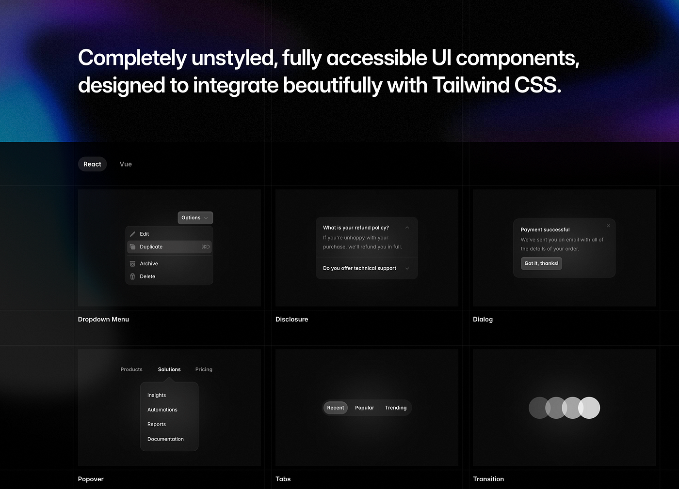
Headless UI, developed by Tailwind Labs, is a collection of unstyled, fully accessible UI components that integrate seamlessly with Tailwind CSS. It allows developers to implement custom designs without the constraints of pre-defined styles, ensuring accessibility and ease of use.
Headless UI is the perfect companion for Tailwind CSS users, enabling developers to build accessible, customizable components without default styling limitations.
The library supports React and Vue frameworks, providing components such as menus, list boxes, combo boxes, switches, disclosures, dialogs, popovers, tabs, transitions, and various form elements. These components handle complex behaviors and accessibility features, allowing developers to focus on styling and functionality.
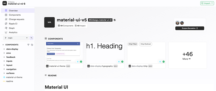
3. MUI Base (Material UI)
GitHub Stars: 90.5k | Forks: 30.5k | NPM Downloads: ~ 5.8M/month

Base UI features many of the same components as Material UI, but without the Material Design implementation.
MUI Base, part of the Material UI ecosystem, offers unstyled components as an alternative to the fully styled Material UI library. It provides the foundational logic of Material UI components without any imposed styles, making it suitable for teams who want the functionality of Material UI without its predefined Material Design aesthetics.
MUI Base components allow teams to apply their own design language while using the reliable structure of Material UI, fitting into custom design systems that require both flexibility and robustness.
The library integrates well with custom theme management, leveraging MUI’s extensive documentation and support. It also provides a robust component API based on Material UI, ensuring consistency and ease of use in large projects.
Check out the following Design System built using Material UI. You can build a similar one for Base UI by replacing the components with Base UI components.
4. React-Aria by Adobe
GitHub Stars: 9.5k | Forks: 0.6k | NPM Downloads: ~ 0.5M/month
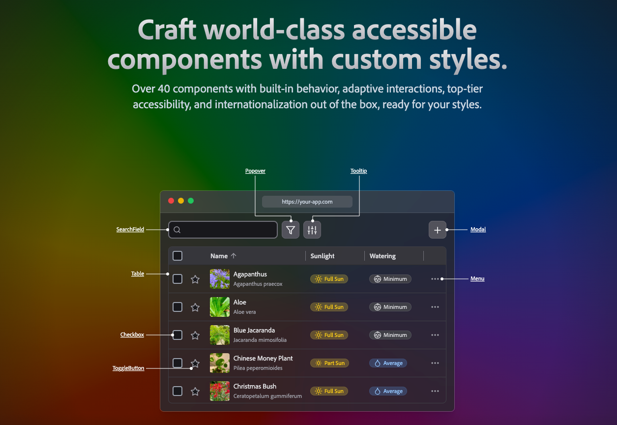
Adobe’s React-Aria is a suite of React hooks for building accessible components without imposing styling. By focusing solely on accessibility, React-Aria provides immense flexibility for developers to design custom UI components while ensuring inclusivity.
React Aria is highly adaptable in design systems where accessibility is critical, giving developers the tools to build fully compliant components from scratch.
One unique feature of this UI library is that it provides hooks for building accessible interactions, which is ideal for teams developing components with strict accessibility standards. In addition, it decouples styling from interaction logic, allowing for seamless integration into any design framework.
5. Chakra UI with Headless Components
GitHub Stars: 37.9k | Forks: 3.3k | NPM Downloads: ~ 4.2M/month
Chakra UI is known for its pre-styled components, but it also offers headless UI options for developers looking for more customization. This blend of pre-styled and headless components makes Chakra a great choice for teams that want flexibility in some areas while benefiting from pre-designed components in others.
Chakra UI combines ease of use with flexibility, offering both styled-components for rapid development and headless components for full customization.
This library is great for teams who need flexibility in certain areas but prefer pre-styled components elsewhere.
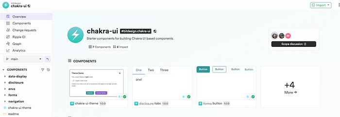
Here is an example of the Chakra UI Design system developed using Bit Platform. You can use it as the base for your own custom design system.
Conclusion
Building a design system with headless UI libraries offers a balance of flexibility, customization, and control over accessibility standards. Developers can build unique, brand-aligned interfaces tailored to specific needs with components that focus on functionality without imposing specific styles.
Platforms like Bit provide a collaborative environment for creating and sharing components, making design systems reusable and composable across multiple projects.
Thanks for Reading. Cheers !!!

