Does your interviewee understand CSS layouts?
Does the developer you interview truly understand CSS layouts… let’s check!

Recently, I was asked to review/rework a front-end coding test for potential hires. A colleague of mine suggested using HackerRank, as he had reasonably good outcomes from his data science coding test, and it didn’t take him too much effort to set up. Unfortunately, I realised that CSS isn’t something that services like HackerRank caters for very well.
Tip: Use Bit to reuse components and build faster! Easily organize and use your components to build more apps with your team. Give it a try.
I don’t see this as HackerRank’s fault, because it does really well for testing on algorithms, general programming concepts and test-driven development in general. Because the grading is done against a suite of test cases, as it should be in ideal real-world development scenarios.
The thing about HackerRank is that, firstly, CSS is not “supported” as a language option you can limit candidates to. There was one particular CSS layout question I thought was promising, but it seemed to imply the candidate ought to use Javascript for the solution (more details in the section below).

Automated coding tests for CSS are not ideal
Don’t get me wrong, I understand why coding tests are necessary in general, but I don’t think there is a good way to automate them for CSS. Because there are many ways to achieve the same result and none of them are absolutely right or wrong. Regardless, today, we’re not going to talk about my opinion on coding tests.
Instead, I want to take you through my thought process of how I would check for an understanding of CSS layout. And initiate further conversation based on the proposed solution.
Those who know me well might immediately suspect whether this is just a ploy on my part to talk about CSS…
No comment.
Issues with the original question
The original question wanted a 1x4 flexible grid with a 1px black border. The width of each column had to be a quarter of the window size no matter how the page was resized. And each cell of the grid was supposed to be able to contain another 1x4 flexible grid.
Then came the bit that made me cringe a bit, largely because of the wording, because it stated “Perform the following operations based on the value of window size”, which, to me, conveyed the idea that you had to use Javascript to calculate and style the grid.
If the window size was less than 720px, the layout becomes a 2x2, and if the windows size decreased further to 360px and below, the layout becomes 4x1. The columns in the layout had to flow in a horizontal, top-to-bottom writing direction.
Based on the description of the use-case, Javascript is the wrong tool to build this layout. But I suspect that the grading algorithm runs the candidate’s input through test cases that evaluate the Javascript functions and their resultant values.
But Javascript is actually not required at all for this layout. A CSS-only solution would be much better, and can serve as the basis for an interesting conversation about doing layout.
The setup
At first, I considered pre-writing the HTML and letting the (I hate using this term but…) candidate fill in the styles, but I realised it would be even more telling if they wrote the HTML themselves.
What I’ve noticed among some developers who started out with frameworks like Bootstrap and kept at it, is they tend to nest divs more often. Some even don’t realise that certain styles can be applied on the same div without additional nesting.
So the setup became an image of what I’d like the end result to look like, with no specific restrictions on how the markup should be nor what techniques to use. It is a modification of the HackerRank question described above.

The instructions would go something like this:
The image shows a 2x4 grid of items. Build a layout, similar to what is shown in the image, that goes from 4 columns to 2 columns when the window is less than 720px wide, and goes to a single column when the window is less than 360px wide.
The columns should always be of equal width. Nest an instance of the 4–2–1 grid within the first and seventh items. Include some text content within each grid cell so there are no empty elements.
Please refer to the image for clarity on what is required.
By keeping the instructions relatively free-form, candidates can choose any technique they like, and a conversation can be had with regards to why they chose a certain approach.
Using display: inline-block
One way to do it is with display: inline-block. Setting the display property of an element to inline-block makes it an inline element, which lets it participate in an inline formatting context as a single opaque box. Inline content is distributed in lines, so once each item has a width of 25% of its containing block, they will be laid out into a 4-column grid.
A caveat to this approach is that for inline elements, browsers will translate line breaks and spaces in the HTML into actual spaces on the displayed content, just like how spaces are added between words. This is why an element’s font size will affect the gaps between inline elements.
There are a number of approaches to deal with this gap issue. You can either:
- remove the spaces between affected elements in the HTML
- separate each affected element with comments instead of spaces
- apply a negative margin between each affected element
- omit the closing tag for each affected element
- set the font size for the affected elements to zero
If the candidate chooses this approach, unless the amount of content in each cell is exactly the same, they may have to deal with the issue of uneven heights for content on the same row. But depending on the type of content being displayed, this may or may not be a problem.
<!-- Example of HTML for inline-block implementation --><div class="inline__item"><div class="inline__item">inner 1</div><div class="inline__item">inner 2</div><div class="inline__item">inner 3</div><div class="inline__item">inner 4</div></div><div class="inline__item">
    <p>2</p>
</div><div class="inline__item">
    <p>3</p>
</div><div class="inline__item">
    <p>4</p>
</div><div class="inline__item">
    <p>1</p>
</div><div class="inline__item">
    <p>2</p>
    </div><div class="inline__item"><div class="inline__item">inner 1</div><div class="inline__item">inner 2</div><div class="inline__item">inner 3</div><div class="inline__item">inner 4</div></div><div class="inline__item">
    <p>4</p>
</div>---/* Example of CSS for inline-block implementation */@media screen and (min-width: 360px) {
  .inline__item {
    display: inline-block;
    width: 50%;
  }
}@media screen and (min-width: 720px) {
  .inline__item {
    width: 25%;
  }
}
Relevant specification: CSS2.1–9.2.2 Inline-level elements and inline boxes
Using floats
Another approach is to use floats, the main issue faced would be clearing them at each breakpoint. A floated box is one what has been shifted to the left or right of the current line. The shift will continue until the box’s outer edge reaches the edge its containing block or the outer edge of another floated box.
If there isn’t enough horizontal space for the floated box, it will be shifted downwards until it fits or if there are no more floated boxes present. A floated box is no longer in normal flow, so content will flow around the floated box if there is enough space for it.
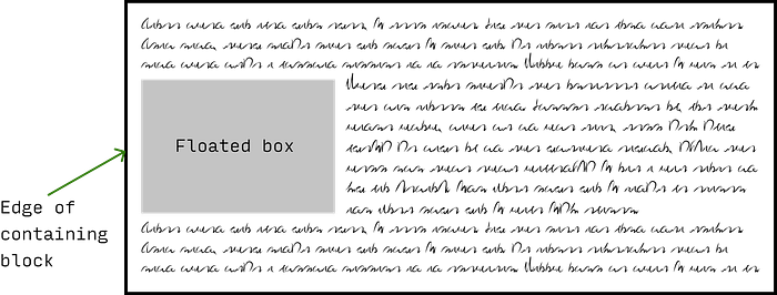
This is where the concept of clearance comes it. By setting a clear property on an element adjacent to a float, we can push the element vertically past the float. Clearance also prevents the phenomena of margin collapsing. The actual computation of clearance is detailed in the specification, but unless you’re a browser implementer, you don’t have to know it.
If this is the chosen approach, a discussion could ensue on what’s the least amount of code necessary to achieve a 4–2–1, because depending on how the media queries are structured, there could be some overriding involved, or not at all.
<!-- Example of HTML for floats implementation --><div class="float__item">
    <div class="float__item">inner 1</div>
    <div class="float__item">inner 2</div>
    <div class="float__item">inner 3</div>
    <div class="float__item">inner 4</div>
</div>
<div class="float__item">
    <p>2</p>
</div>
<div class="float__item">
    <p>3</p>
</div>
<div class="float__item">
    <p>4</p>
</div>
<div class="float__item">
    <p>1</p>
</div>
<div class="float__item">
    <p>2</p>
</div>
<div class="float__item">
    <div class="float__item">inner 1</div>
    <div class="float__item">inner 2</div>
    <div class="float__item">inner 3</div>
    <div class="float__item">inner 4</div>
</div>
<div class="float__item">
    <p>4</p>
</div>---/* Example of CSS for floats implementation */@media screen and (min-width: 360px) and (max-width: 719px) {
  .float__item {
    float: left;
    width: 50%;
  }

  .float__item:nth-of-type(even) {
    clear: right;
  }

  .float__item:nth-of-type(2n + 1) {
    clear: left;
  }
}@media screen and (min-width: 720px) {
  .float__item {
    float: left;
    width: 25%;
  }

  .float__item:nth-of-type(4n+1) {
    clear: left;
  }
}
Relevant specification: CSS2.1–9.5 Floats
Using display: flex
At time of writing, the preferred approach would be to utilise flexbox, given its widespread support and ease of implementation. And a good understanding of how the flexible box model works is definitely a plus. Ideally, we’d want to use the flex shorthand because it correctly resets any unspecified components to accommodate common use-cases.
The shorthand can take in 1, 2 or 3 values, and will yield different computed values (assuming the values are all valid), depending on whether the value has units or not. There are 4 values for flex that represent the most commonly desired effects, which are summarised in the table below.
https://gist.github.com/huijing/c188cca67640ce329cc9d096926ef08c
The thing that trips up developers new to flexbox is how items are sized when in a flex formatting context, because of the interplay between the flex-grow, flex-shrink and flex-basis properties. A key thing to note is that flex-basis is what flex sizing is calculated from.
If flex-basis is set to 0, and flex-grow is set to 1, for example, this implies the flex items have no set initial width, and all space in the flex container will be distributed among them equally. However, if flex-basis is set to auto, only available space is distributed, so the size of content within each flex item also factors into their sizing.
Generally, a good understanding of how flexbox works is a very good sign indeed.
<!-- Example of HTML for flexbox implementation --><div class="flex">
    <div class="flex__item flex">
        <div class="flex__item">inner 1</div>
        <div class="flex__item">inner 2</div>
        <div class="flex__item">inner 3</div>
        <div class="flex__item">inner 4</div>
    </div>
    <div class="flex__item">
        <p>2</p>
    </div>
    <div class="flex__item">
        <p>3</p>
    </div>
    <div class="flex__item">
        <p>4</p>
    </div>
    <div class="flex__item">
        <p>1</p>
    </div>
    <div class="flex__item">
        <p>2</p>
    </div>
    <div class="flex__item flex">
        <div class="flex__item">inner 1</div>
        <div class="flex__item">inner 2</div>
        <div class="flex__item">inner 3</div>
        <div class="flex__item">inner 4</div>
    </div>
    <div class="flex__item">
        <p>4</p>
    </div>
</div>---/* Example of CSS for flexbox implementation */@media screen and (min-width: 360px) {
  .flex {
    display: flex;
    flex-wrap: wrap;
  }

  .flex__item {
    flex: 50%;
  }
}@media screen and (min-width: 720px) {
  .flex {
    display: flex;
    flex-wrap: wrap;
  }

  .flex__item {
    flex: 25%;
  }
}
Relevant specification: CSS Flexible Box Layout Module Level 1
Using display: grid
Even though I mentioned that flexbox is the preferred approach, truth be told, this layout is best served by using CSS grid. Because there is a relationship between the rows and columns of the grid. CSS grid introduces a number of handy functions, like repeat() and minmax(), that can help us create grids that adapt well to the viewport with less code.
Support for grid is pretty good at the moment, but to be safe, testing for browser support with feature queries is highly recommended. Any of the previous approaches would work well as the fallback, so set it up such that the grid code will only take effect if the browser supports grid.
If the candidate chooses the grid approach, I would take it as a rather positive signal. Conversations can be had with regards to fallbacks, use of functions like repeat(), even subgrid, which is still considered cutting edge as of time of writing.
<!-- Example of HTML for grid implementation --><div class="grid">
    <div class="grid__item grid">
        <div class="grid__item">inner 1</div>
        <div class="grid__item">inner 2</div>
        <div class="grid__item">inner 3</div>
        <div class="grid__item">inner 4</div>
    </div>
    <div class="grid__item">
        <p>2</p>
    </div>
    <div class="grid__item">
        <p>3</p>
    </div>
    <div class="grid__item">
        <p>4</p>
    </div>
    <div class="grid__item">
        <p>1</p>
    </div>
    <div class="grid__item">
        <p>2</p>
    </div>
    <div class="grid__item grid">
        <div class="grid__item">inner 1</div>
        <div class="grid__item">inner 2</div>
        <div class="grid__item">inner 3</div>
        <div class="grid__item">inner 4</div>
    </div>
    <div class="grid__item">
        <p>4</p>
    </div>
</div>---/* Example of CSS for grid implementation *//* Any of the previous methods would work well as a fallback */@supports (display:grid) {
  @media screen and (min-width: 360px) {
    .grid {
      display: grid;
      grid-template-columns: repeat(2, 50%);
    }
  }  @media screen and (min-width: 720px) {
    .grid {
      grid-template-columns: repeat(4, 25%);
    }
  }
}
Relevant specification: CSS Grid Layout Module Level 1
Wrapping up
I suppose the problem people have with testing CSS is that there are many different ways to achieve the same result, each with their pros and cons. It’s more like an open-ended essay than a multiple-choice question, which probably makes it harder to test for systematically.
It is not necessary for someone to submit all possible methods to build this layout. The key is to understand exactly how and why the chosen approach works and be open to discussing other possible approaches as well.
An implementation of all 4 approaches is available at this link, if you’re interested to see how the code works in a browser. Please feel free to comment and ask any question :)


