UI Component Documentation: A Developer’s Guide
Learn how to effectively document UI components. Discover best practices , challenges, and tools to streamline the documentation process, improve collaboration, and maintain consistency across projects.

Building and maintaining reusable UI components is pivotal for creating scalable, maintainable, and consistent user interfaces. However, as the complexity and number of components grow, so does the challenge of keeping everything well-documented and accessible to developers across projects. This is where UI component documentation becomes a critical tool in a developer’s arsenal.
This guide explores Bit as an all-in-one tool that handles everything your UI components need, from birth to released packages, with documentation, examples, and other helpful information.
Packages published and documented with Bit will be available on the Bit Platform (and optionally published to other package registries).

1. Creating a new UI component
We’ll start by installing Bit and setting up a Bit workspace to develop and document our components:
npx @teambit/bvm install
bit init my-components --default-scope MY_ACCOUNT.MY_SCOPE
cd my-components
Replace
MY_ACCOUNTwith your username on Bit Platform, andMY_SCOPEwith the specific scope you created in Bit Platform to publish your components to.
Now that everything is set up, we can start creating our first component. Bit is framework agnostic, but we’ll use React to demonstrate a simple workflow for this guide.
We’ll use Bit’s React template and name our component ‘color-picker’:
bit create react color-pickerYou’ll find the source files for the newly created component nested in a color-picker directory:
├── my-account
     └── color-picker
        ├── color-picker.composition.tsx # component examples
        ├── color-picker.docs.mdx        # component docs
        ├── color-picker.spec.tsx        # test file
        ├── color-picker.tsx             # implementaion file
        └── index.ts                     # entry file (the "main" file in the generated package)
The generated component is a simple “hello world” implementation. We’ll update the color-picker.tsx file and add a color-picker.module.css file, to implement a basic color picker component.
/**
 * @filename: color-picker.tsx
 */

import React, { useState } from 'react';
import styles from './color-picker.module.css';

interface ColorPickerProps {
  label?: string;
  initialColor?: string;
  onChange?: (color: string) => void;
}

export const ColorPicker = ({
  label = 'Select a color:',
  initialColor = '#ffffff',
  onChange,
}: ColorPickerProps) => {
 // ...
};
2. Creating component examples
To test our component in its different states and variations, and provide a few examples for our component docs, we’ll head over to the .composition.tsx file and export usages of this component. For example:
/**
* @filename: color-picker.composition.tsx
*/

import { ColorPicker } from './color-picker.js';

export const BasicColorPicker = () => {
  return <ColorPicker />;
};

export const ColorPickerWithCustomLabel = () => {
  return <ColorPicker label="Pick a color:" />;
};

export const ColorPickerWithCustomInitialColor = () => {
  return <ColorPicker initialColor="#000000" />;
};
A single component can have multiple
.composition.tsxfiles.
Run Bit’s dev server to see the examples rendered in your browser:
bit startThe examples appear at the bottom of the documentation, as well as separately, in the ‘Preview’ tab:
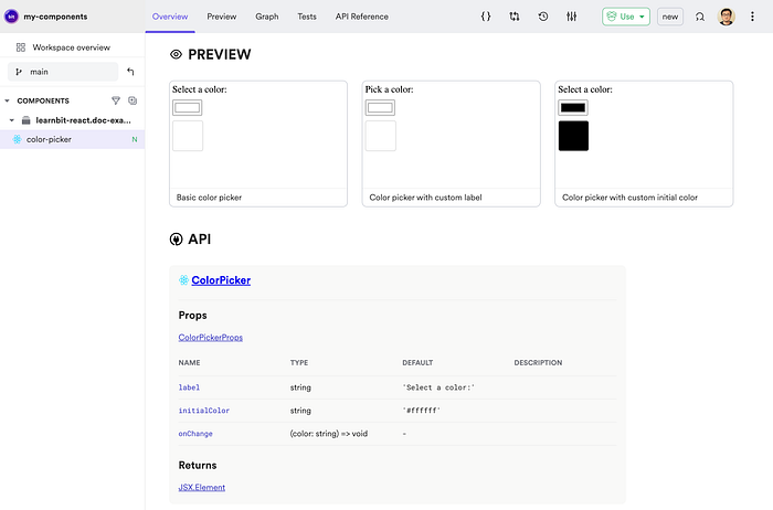
Note that Bit has already generated an API reference for our component based on its TS types and JSDocs.
3. Creating component docs
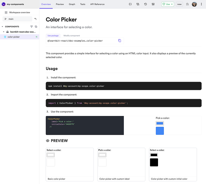
So far we’ve created a few component examples for our documentation. To enrich our documentation with additional verbal explanations and live playgrounds, we’ll head over to the .docs.mdx file. As this file extension reveales, it is an MDX file. That means we can mix JSX and Markdown for a healthy of readability and flexibility.
---
description: An interface for selecting a color.
---

import { ColorPicker } from './color-picker';

This component provides a simple interface for selecting a color using an HTML color input. It also displays a preview of the currently selected color.

## Usage

1. Install the component:

```bash
npm install @my-account/my-scope.color-picker
```

2. Import the component:

```js
import { ColorPicker } from '@my-account/my-scope.color-picker';
```

3. Use the component:

```jsx live
<ColorPicker label="Pick a color:" initialColor="#4287f5" />
```
4. Sharing on component on Bit Platform
When you’re done with changes to your component or its documentation, version it with a new release version and export it to Bit Platform.
bit tag --message "initial version with docs"
bit export
The component is now discoverable on Bit platform, along with docs, examples, API reference and more. It can be installed in any project using package managers like npm, pnpm, and yarn, or installed in Bit projects using bit.
For example, see the shared version of this demo component on Bit Platform.
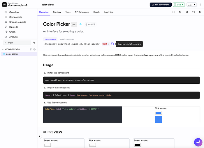
npm i @learnbit-react/doc-examples.color-pickerTo learn more visit the Bit documentation site and the Bit platform:

